The Challenge
The concept of mental health has long been recognized, and its significance has intensified notably amid the pandemic. In a CDP webinar, psychologist Huong Diep from the Headington Institute stressed the challenges we all face. As she articulated, the pervasive impact of these experiences has placed emotional strains on us all. The pandemic has particularly complicated seeking assistance, given the recommendation to remain home to minimize Covid-19 exposure. My aim was to create a solution that enables individuals to access help from the comfort of their homes, mitigating concerns about potential Covid-19 transmission.
Goals
My goal is to offer supplementary resources on mental health, fostering an environment where individuals feeling overwhelmed are encouraged to seek assistance. I plan on designing an app featuring a tranquil and soothing aesthetic, ensuring a serene user experience.
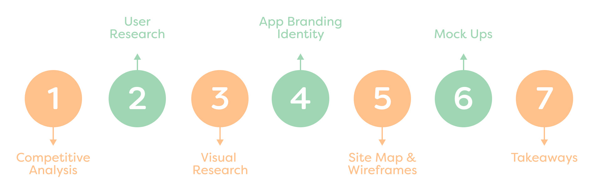
Deisgn Process
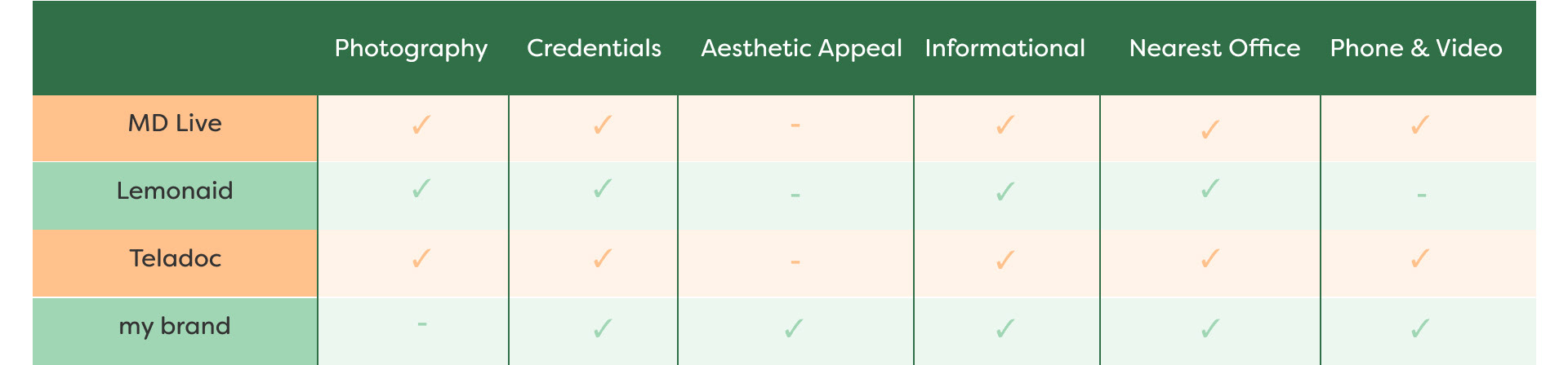
Competitive Analysis: Exploring the Mental Health Consulting App Landscape
My primary objective was to develop a user-friendly mental health consulting app with an engaging appeal targeted towards a younger demographic. Delving into the landscape of existing one-on-one consulting apps, it became apparent that a prevailing trend toward formal design was prevalent. This prompted me to delve deeper into the analysis of apps such as MD Live, Lemonaid, and Teladoc.
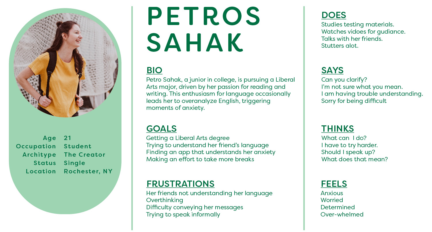
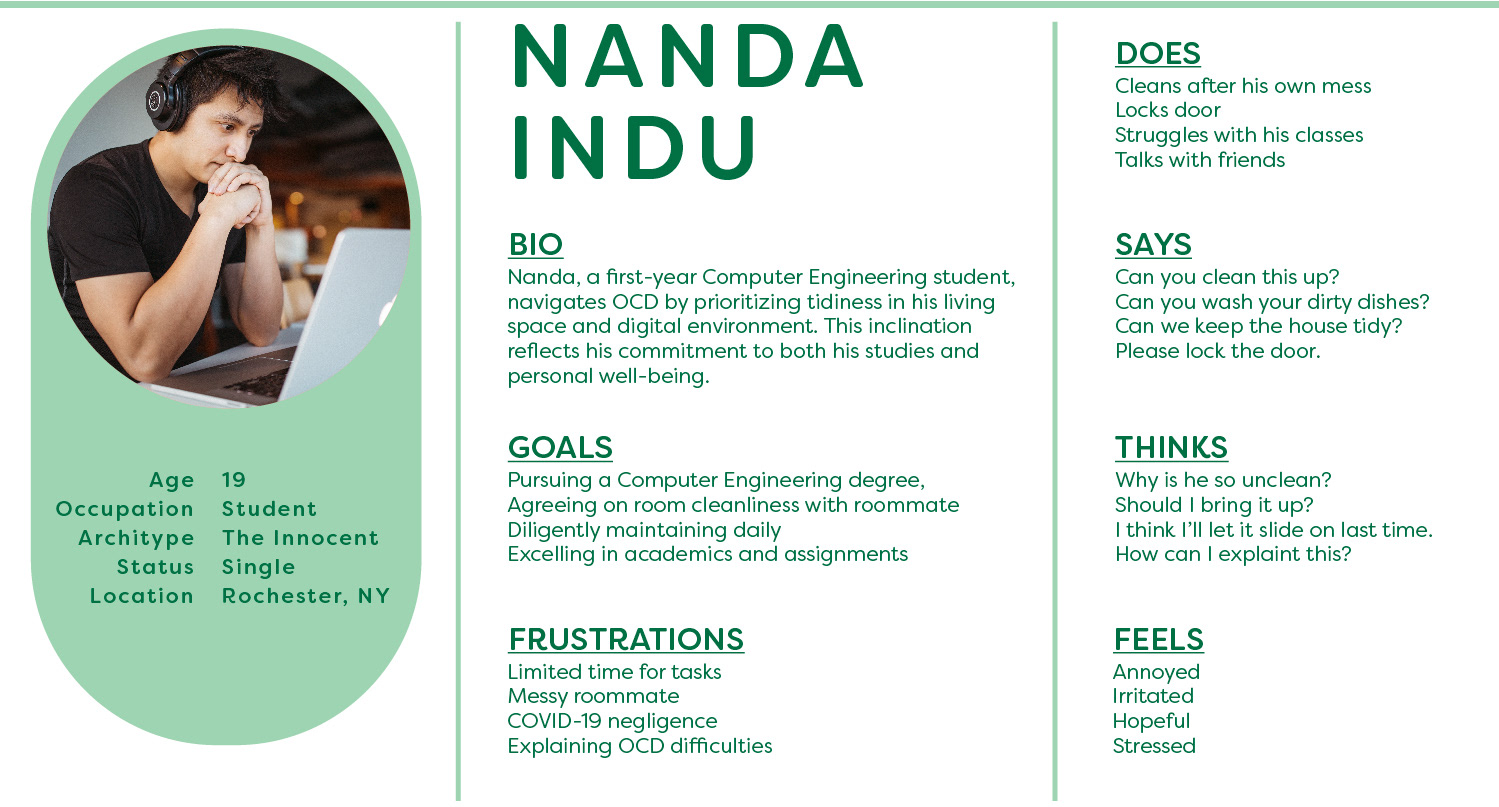
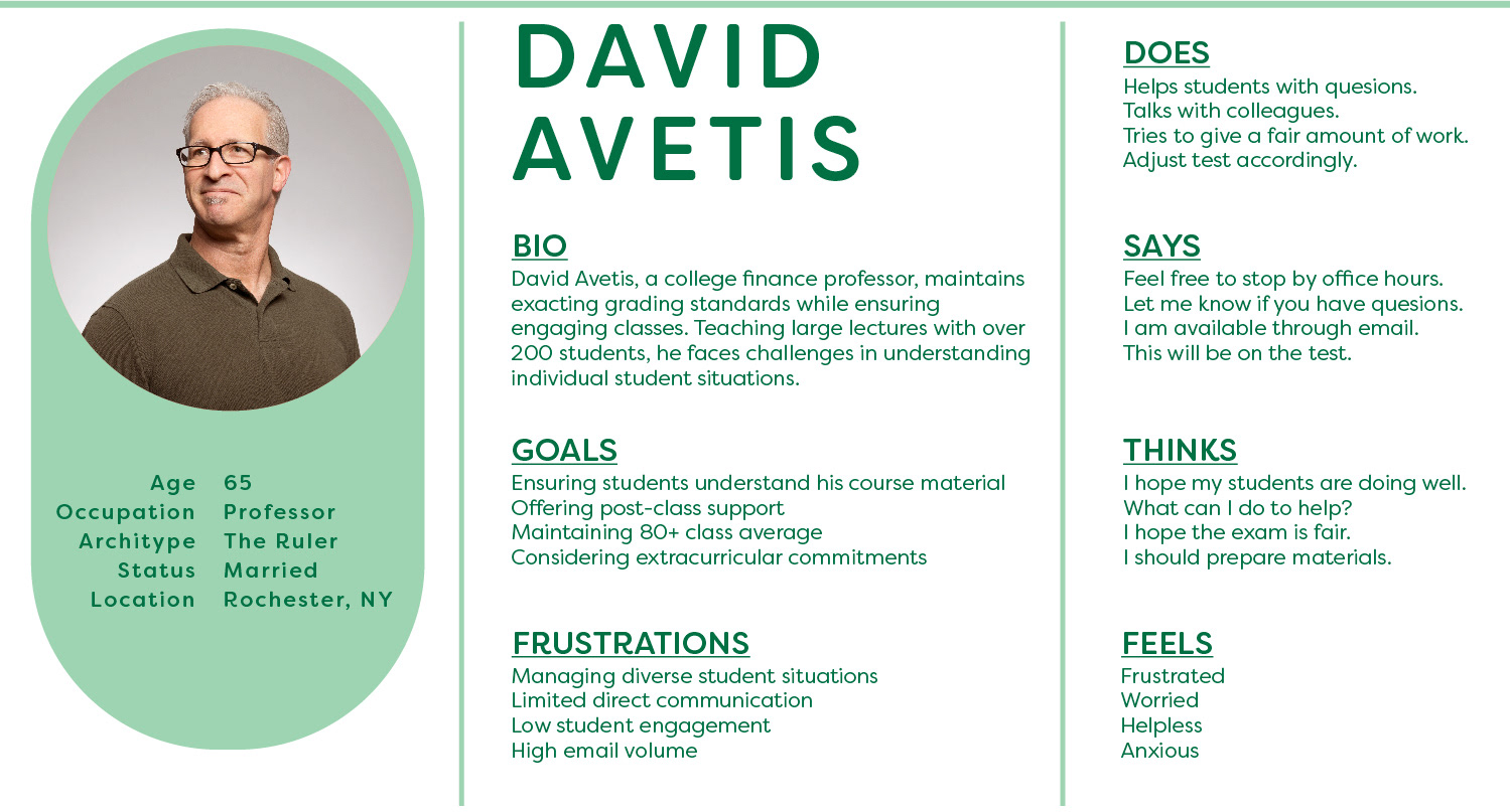
User Research: Developing Personas to Bridge Mental Health Awareness
Conducting user research, I crafted three personas tailored to my target audience of students grappling with mental health challenges. I also perceived this as a valuable opportunity to not only create personas aligned with my target audience but also to initiate a broader educational initiative concerning mental health. By presenting relatable personas and their struggles, my aim was to cultivate a more inclusive and open discourse surrounding mental health matters.
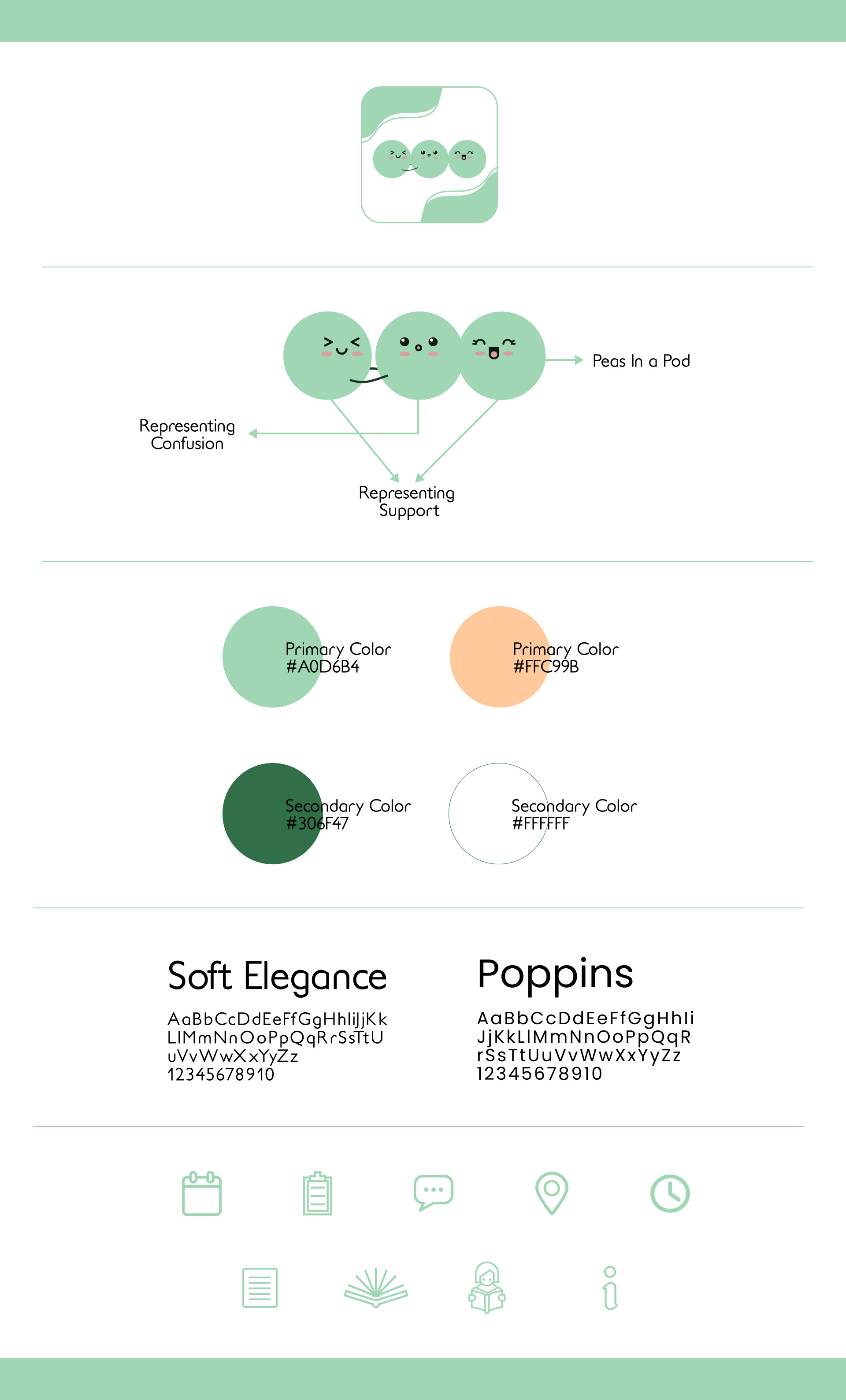
Visual Research: Creating a Calm Atmosphere
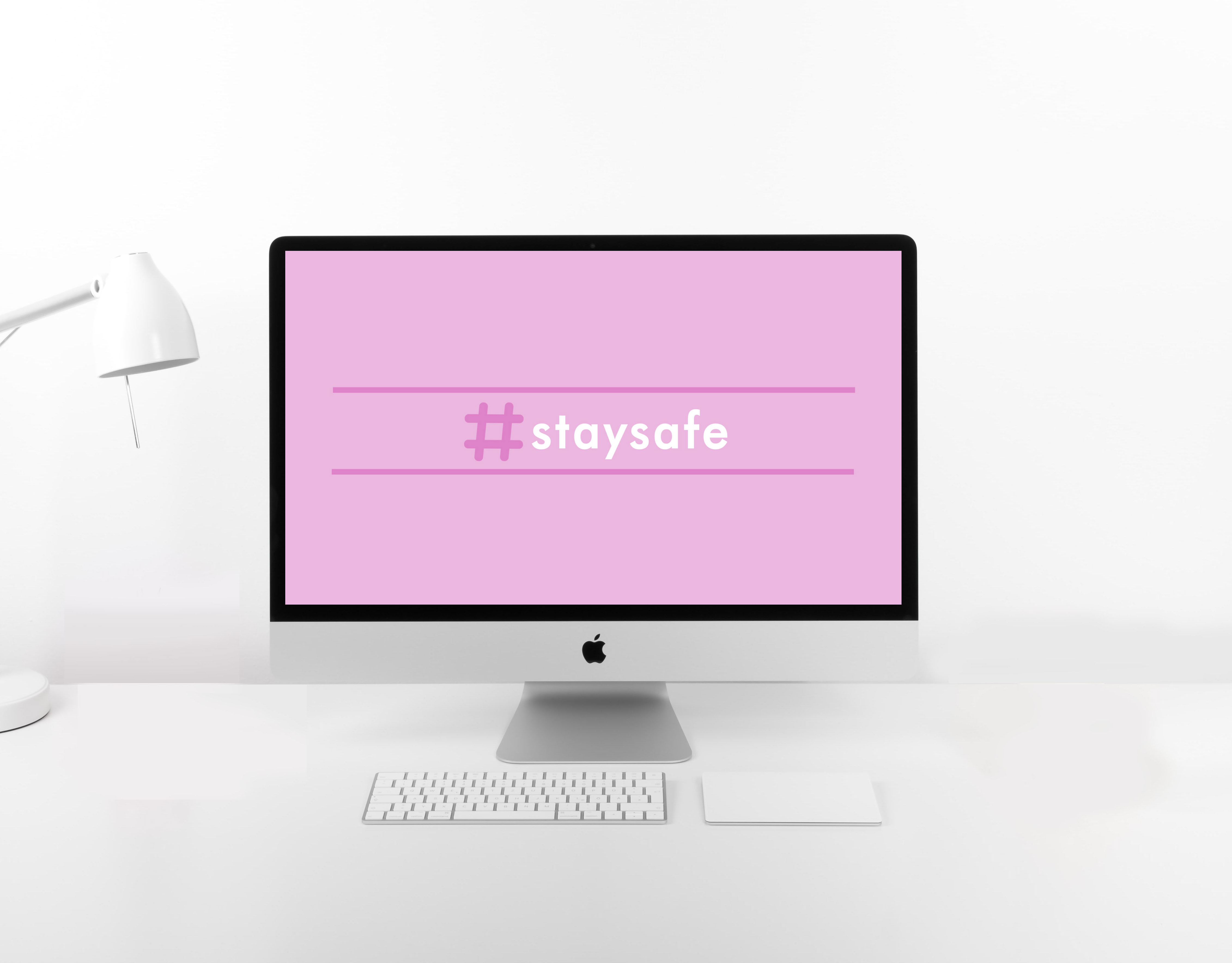
Upon establishing my target audience, I embarked on envisioning the app's visual design. Drawing insights from my competitive analysis, I aimed to infuse my visual research with these learnings. I aspired for the app's aesthetic to exude a tranquil and soothing ambiance. Selecting green as the primary color was a deliberate choice, as it aligns with the official color of the mental health ribbon.

App Branding Identity: Developeing a Serene Visual Identity
Drawing inspiration from vibrant visual and captivating marketing research, I assembled a dynamic and friendly brand identity that's set to infuse spirited charm into my app's design interface. Additionally, I introduced a friendly mascot-logo to symbolize the app's supportive features.
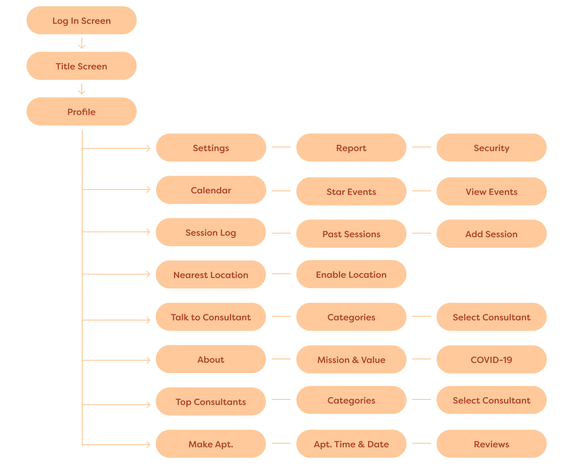
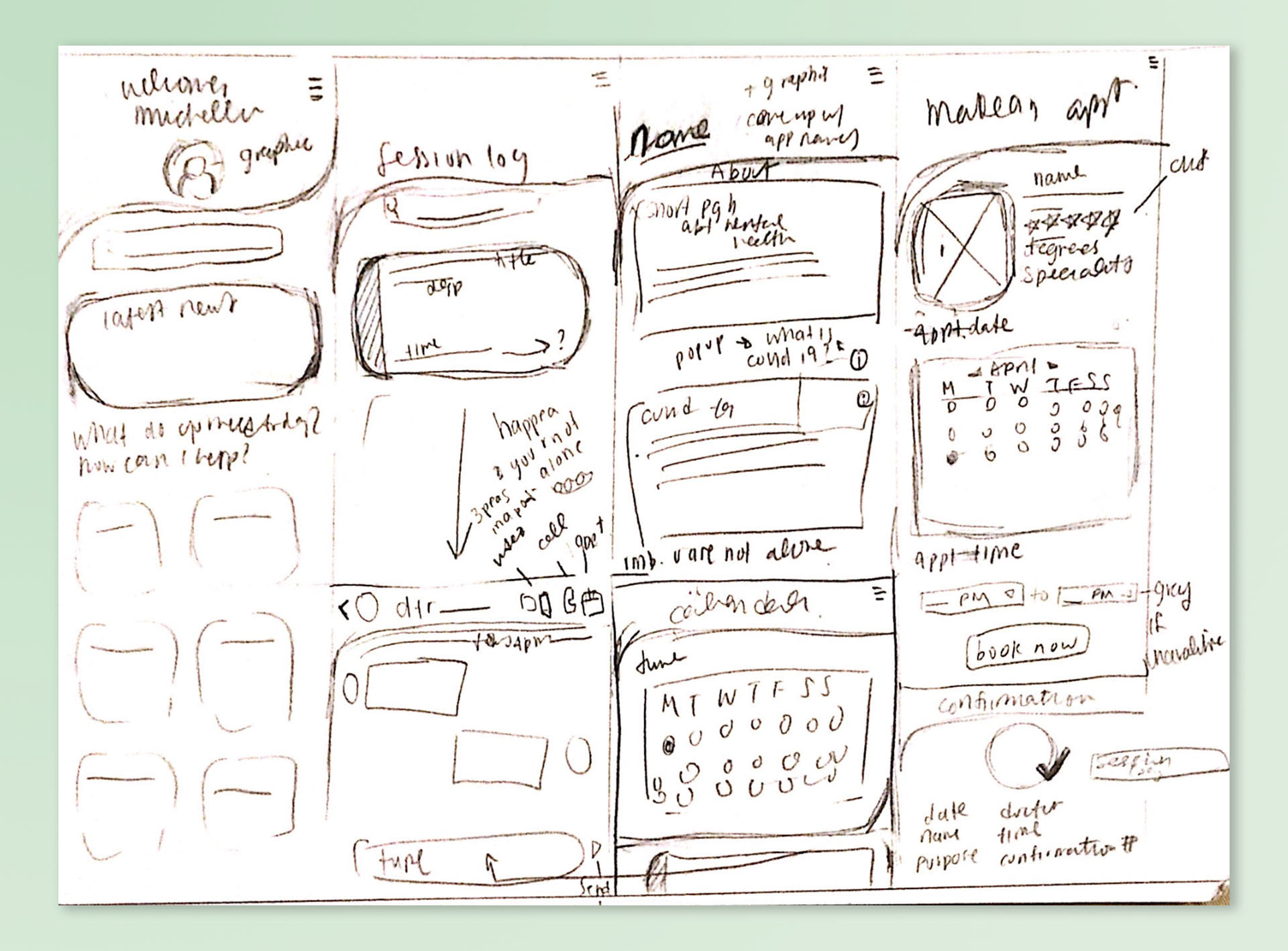
Site Map & Wirefarmes: Strategizing User Flow and Design Elements
I created a detailed site map using information from my competitive analysis. To match today's needs, I added extra pages such as a COVID-19 page. Then, I started making wireframes to lay out the design for important pages. I focused on some of the most common pages people would use.
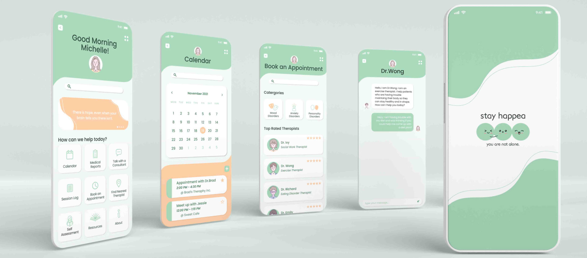
Mock Ups: Enhancing and Perfecting Designs
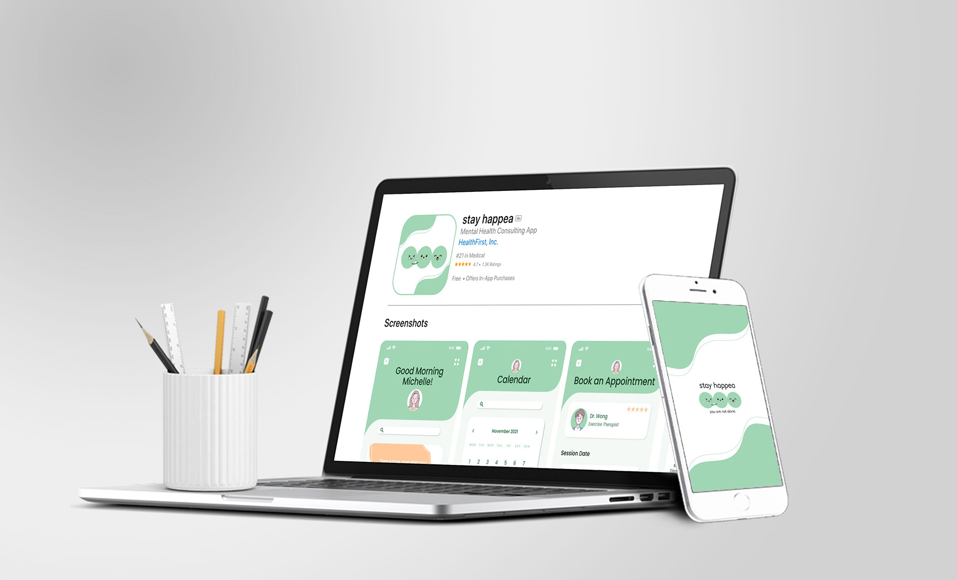
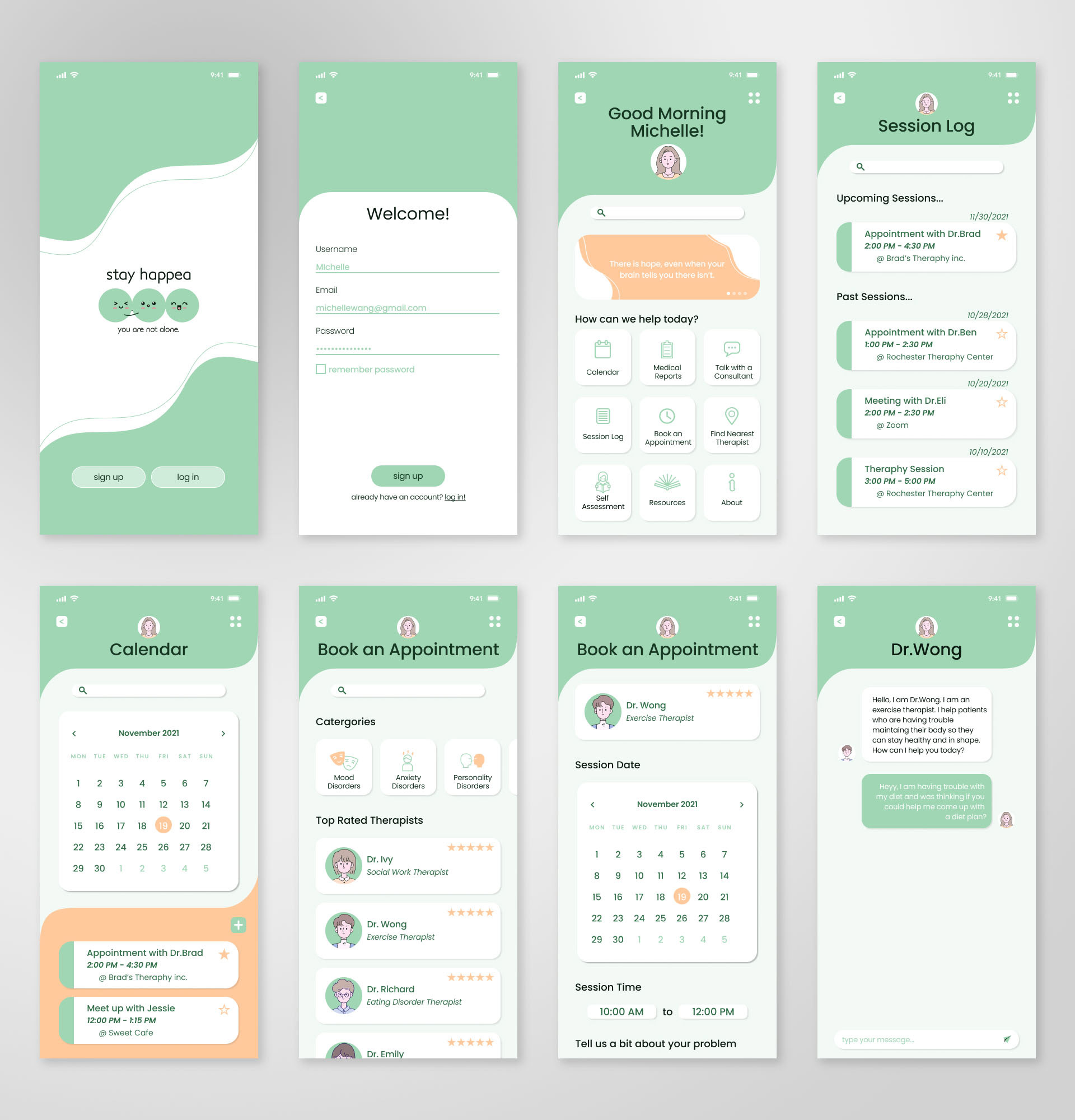
Below, you'll find the completed screens in their fully mocked-up form, showcasing their visual appearance and layout. Additionally, I crafted a dedicated app store page to enhance the user experience as if interacting with a real product. I've also included a demo of the app.
Takeaways
I really enjoyed working on this project. It's important to me because I have friends dealing with mental health issues who hesitate to seek help. I hope this project encourages others to find resources for their mental health. I want a world where we show more care and understanding to those dealing with mental health challenges. Let's break down stigma, support each other, and make seeking help a positive experience!